Columns
Columns can be used to lay out content side by side. For example, a 2-column layout is perfect for placing buttons, images, or text next to each other.
Behind the scenes, columns use a 12-block grid system. This flexible layout system allows you to mix and match column widths to create a variety of layouts.
1
2
3
4
5
6
7
8
9
10
11
12
You’ll never use all 12 columns as that would make each column too narrow to fit any content. Instead, combine grids to create more usable layouts. Assign up to 12 grids per column to define the width of each column. Most of the time, the columns have to add up to 12 (see below for exceptions).
Examples
2 Columns With the Same Width
Each column in the example below was assigned 6 grids (6 + 6 = 12).
QUESTIONS?
For questions or inquiries, contact email@med.unc.edu
TRAINING NEWS
Stay current on training opportunities
Join our training news email list
2 Columns of Unequal Width
The first column in the example below was assigned 4 grids and the second column was assigned 8 grids (4 + 8 = 12). You can assign however many grids per column so long as they add up to 12 (there is an exception that is explained below).

This is a Header
This 2-column layout is split 1/3 and 2/3. The first column uses 4 grids and the second uses 8 grids which adds up to 12.
3 Columns With Equal Width
Each column in the example below was assigned 4 grids (4 + 4 + 4 = 12).

Education
Lorem ipsum dolor sit amet, consectetur adipiscing elit. Nullam vel nibh pretium, luctus libero nec, tristique nunc.

Research
Lorem ipsum dolor sit amet, consectetur adipiscing elit. Nullam vel nibh pretium, luctus libero nec, tristique nunc.

Patient Care
Lorem ipsum dolor sit amet, consectetur adipiscing elit. Nullam vel nibh pretium, luctus libero nec, tristique nunc.
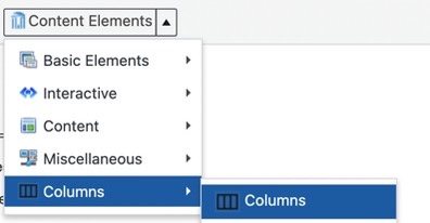
How to Add Columns
Insert Columns
In the editor toolbar, select Content Elements then choose Columns.
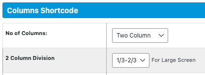
Configure the Columns
No of Columns – select how many columns you want in your layout.
Column Division – define how to divide the available space across the columns.
Column Specification – this lets you control how wide each column is for different screen sizes – Large, Medium, Small, and X-small. This is important because what looks good on a desktop might not work on a phone. Customizing the column widths for each screen size ensures your content is responsive and easy to read on any device.
- For Large screens, column widths are automatically assigned based on the Column Division setting.
- For Medium, Small, and X-small screens, each column defaults to 12 (full width), but you can change this.
- Each column can be assigned a value from 1 to 12, and the total should add up to 12 – with one exception.
- In most cases, the grid value used for Large screens work well for Medium and Small screens.
- Here’s the exception where you might not want the columns to add up to 12. On X-Small screens, content can become cramped if columns are displayed side by side. In these cases, it’s best to have the columns stack vertically. To do this, simply assign each column the full 12 grids. See the “Responsive Layout” section below for further explanation.

Responsive Layout
The columns shortcode is a 12-grid system, which means each row has up to 12 grids available per screen size.
To create responsive layouts, you have two options:
- Side-by-side layout: divide the 12 grids across multiple columns (e.g., 6 + 6, 4 + 4 + 4, 5 + 7). This is why you are using the columns shortcode – because you want to lay out content side by side. However, this type of layout doesn’t always work well on x-small screen sizes. On x-small screen sizes, a stacked layout in preferred.
- Stacked layout: Assign each column the full 12 grids to make them stack vertically.
To make the 4-column layout below responsive, I used the following settings:
- Large screens – each column was assigned 3 grids (3 + 3 + 3 + 3 = 12).
- Medium and Small screens – I want the layout to change so that the second two columns stack below the first two. To do this, each column was assigned 6 grids.
- X-small screens – I want all the columns to stack on top of each other so each column was assigned 12 grids.
Resize your browser window to see the responsive design in action.
Directory
Newsletter
Contact Us
Donate
This is what the settings look like:

Centering Content
Adding center-content to the Custom Class field will center the content within all columns.
The Shortcode
Once you’ve defined the settings and clicked the Insert Columns button, shortcode will be place on your page. This shortcode is what defines your columns. It starts with an opening [row] tag and ends with a closing [/row] tag. Within the row is code for each column. A starting column [column] and ending [/column] tag. Within each column tag is the word Text. This is placeholder text that you need to replace with your own content – images, headers, text, links, other shorcode such as buttons or notification boxes, etc. Be sure to keep all your content within the opening and closing [column] [/column] tags.
Alternative – the Cells Plugin
Be aware that the Cells plugin offers several layout options that display content in columns. These are pre-designed templates where you simply drop in your content. In some cases, Cells layouts can be a quicker and more flexible alternative to using the columns shortcode. However, they may not always meet your exact design needs, so it’s worth exploring both options to see which works best for your content.
Examples On SOM Sites
Click on any image below for a larger version.
Example 1
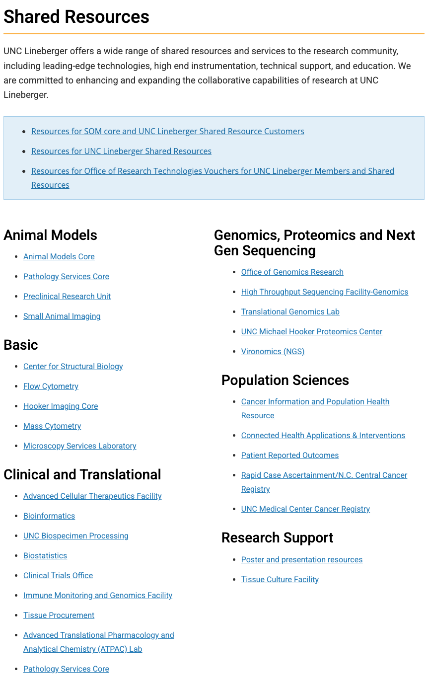
Some sites, such as the Department of Medicine and Lineberger, use columns to display a large quantity of links.

Example Two
Some sites use columns to display news and events side-by-side. Or, in the Faculty Affairs example, they display upcoming events and workshop recordings side-by-side using the columns shortcode.


Example Three
A lot of our sites like to nest other shortcode options, such as notification boxes, buttons and panel boxes, inside of columns.


Example Four
Below are some examples of the columns shortcode used to display a variety of content.


