Full-Width Sections
Full width sections are great for separating content on a page and for adding visual appeal. They were initially designed for use on home pages (pages without left or right sidebars or navigation). Even thought they can be used on pages with sidebars, the effect is not the same. On pages with sidebars, the full-width sections will not span the full width of the browser window, it will only span the full width of the main content area. Since this documentation page contains left-hand navigation (a sidebar) the examples will demonstrate what full-width sections look like on these types of pages. Be sure to check out our alternate example page that demonstrates what full-width sections look like on pages without sidebars.
How to add Full-Width Sections
- Place your cursor where you want the full width section to start.
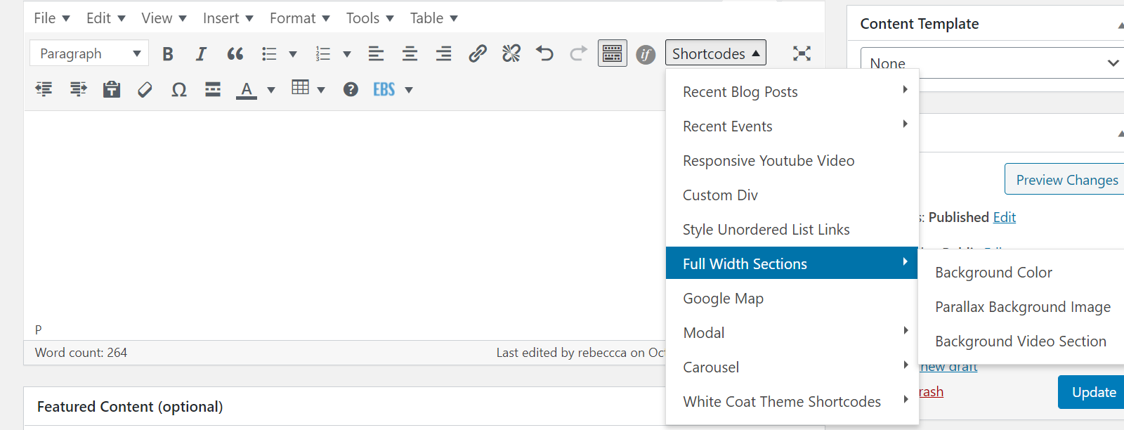
- Navigate to Shortcodes > Full Width Sections in the visual editor.
- Choose from the three available options.
Background Color
The Background Color option will produce a light gray bar with the following code:
[heels_full_width color="#f5f5f5" class=""]Content[/heels_full_width]
Add Your Content
Simply replace the “Content” place-holder text in the above code with your own content. Whatever content you add (text, images, links, headers, etc.), will display on top of the gray bar.
Customize the Color
To customize the color of the full-width section, simply change the hexadecimal color option in the code that says color=”#f5f5f5″. The #f5f5f5 is the hexadecimal color for the default light gray. Simply replace it with the color of your choice.
Important: for legibility purposes, you want to ensure there is enough contrast between the background color and any overlaying text. The default color of the text is dark gray. If you choose a light background color there should be enough contrast. If you choose a dark background color, such as the Carolina navy color (#13294B) as defined in the University Branding and Identity Guidelines, you’ll need to change the color of any overlaying text. To change the font color, select the text then click on the Text Color icon in the editor and choose a color. If you don’t see the Text Color button, click the Toolbar Toggle button. The Toolbar Toggle button shows and hides some optional buttons in the editor.
Examples
Full-Width Section with Background Color
This is the default Background Color option with a light gray background of #f5f5f5.
Full-Width Section with Background Color
This is the Background Color option with navy (#13294B) set as the background color. The overlaid text has been centered and colored white.

Full-Width Section with Background Color
This is the Background Color option with light blue (#edf3f7) set as the background color. The columns shortcode was nested inside the full-width shortcode to obtain the 2-column layout for the overlaid content.
Parallax Background Image
The Parallax Background Image option will display a full-width background image. The background image will get cropped both horizontally and vertically. The vertical display will change as the site visitor scrolls up/down the page. The horizontal display will vary based on browser width. Look at the examples below and scroll up/down the page as well as resize the width of your browser window to see these effects in action. The parallax background image works best with simple/subtle abstract images. Background images with people do not work well with this option.
The initial shortcode will look like this:
[heels_full_parallax color="#f5f5f5" class="" background="your image url"]Content[/heels_full_parallax]
Define the Background Image
Be careful when choosing a background image. The simple/subtle images tend to work best. You’ll also want to use a wide, landscape image. You may wish to use Photoshop or some other graphics program to lighten or darken the image. A background image that is too busy will detract from the overlaid content.
The background image should be at least 2000px wide so that it is large enough for any screen size.
- Upload the background image you wish to use to your sites Media folder.
- Once uploaded, click on the image (still in the Media folder), to bring up the Attachment Details panel. Find the Copy Link field and copy the url. That is the url to the image and you will need to paste that into the shortcode in the next step.
- Go back to the page, event, post, etc. where you are adding the full-width parallax image. In the shortcode, look for background=”your image url”. Replace your image url with the url you copied in step 2 above. Don’t delete the quotes, just replace the content within the quotes.
Add Your Content
Replace the “Content” place-holder text with your own content. Whatever content you add (text, images, links, headers, etc.), will display on top of the background image. If the content is hard to read, you may wish to place it in a notification box. This will help the content stand out from the background image.
Customize the Background Color
It’s important to define a background color. This color will display if the background image doesn’t load. If your background image is light, you’ll want to define a light background color. If your background image is dark, you’ll want to define a dark background color. Remember, you want to provide enough color contrast between the background and any overlaying text/content so that the content remains legible. Please reference the Background Color documentation above on how to set the background color.
Examples
 In the example below, I used a larger version of the image shown to the right. Notice how the background image is cropped and how it changes as you scroll up and down the page (this is the parallax affect) as well as resize the browser window. Due to this cropping effect, we do not recommend using images with people. This background image was muted down and darkened in Photoshop to ensure the overlaid text was legible.
Leading
Lorem ipsum dolor sit amet, consectetur adipiscing elit.
Teaching
Lorem ipsum dolor sit amet, consectetur adipiscing elit.
Caring
Lorem ipsum dolor sit amet, consectetur adipiscing elit.
The example below uses a subtle, abstract background image.
Leading, Teaching, Caring
This is a full-width section with subtle abstract background image. The columns shortcode was nested inside the full-width shortcode to obtain the 2-column layout for the overlaid content.

DON’T DO THIS. The example below demonstrates what you don’t want to do. The overlaid text is simply too hard to read.
Can You Read This Header?
This is an example of what you don’t want to do.
Background Video Section
The Background Video Section option will display a full-width background video. The initial shortcode will look like this:
[heels_full_video poster="your image placeholder url" mp4="your mp4 url" class="" height="520px" align="center" bottom="0%"]Content[/heels_full_video]
Define the Background Video
The video has to be saved to you sites Media folder. It cannot reside on YouTube or another video hosting service. Note that there is a max file size for media files of 64MB.
In the shortcode where it says mp4=”your mp4 url”, replace your mp4 url with the url of the video. Don’t delete the quotes, just replace the content within the quotes.
Define the Poster Image
The poster image is a background image that will display in the event the video doesn’t load.
In the shortcode where it says poster=”your image placeholder url”, replace your image placeholder url with the url of the image. Don’t delete the quotes, just replace the content within the quotes.
Add Your Content
Replace the “Content” place-holder text with your own content. Whatever content you add (text, images, links, headers, etc.), will display on top of the background video. If the content is hard to read, you may wish to place it in a notification box. This will help the content stand out from the background video.
Height
The height setting defines the height of the full-width section.
Alignment
The align setting in the shortcode sets the alignment of overlaid text. You can set this to center, left or right.
Bottom
The bottom setting in the shortcode defines how much padding is added to the bottom of the video. This padding is what pushes the overlaying content up from the bottom edge of the video. The default setting of bottom=”40%” means that 40% of the height of the full-width video section will be added as padding to the bottom of the video. This will cause overlaid text to display almost vertically center over the video. At 90%, the bottom padding will take up 90% of the height, with the text being almost at the top of the full-width section.
Examples
In the example below, the overlaid text was placed inside a notification box to ensure it was legible. The height setting for this video was changed to 550px and the bottom setting changed to 0%.
Oliver Smithies, the School of Medicine’s Weatherspoon Eminent Distinguished Professor of Pathology and Laboratory Medicine, received the Nobel Prize in physiology or medicine in 2007.
Other Examples
Department of Pediatrics
The home page of The Department of Pediatrics shows an example of a full-width parallax background image.
School of Medicine
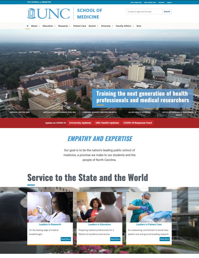
The School of Medicine’s homepage uses a full-width video background with some custom styled text and buttons laid over top. A little further down the page there is an example of the full-width parallax background image.
OBGYN
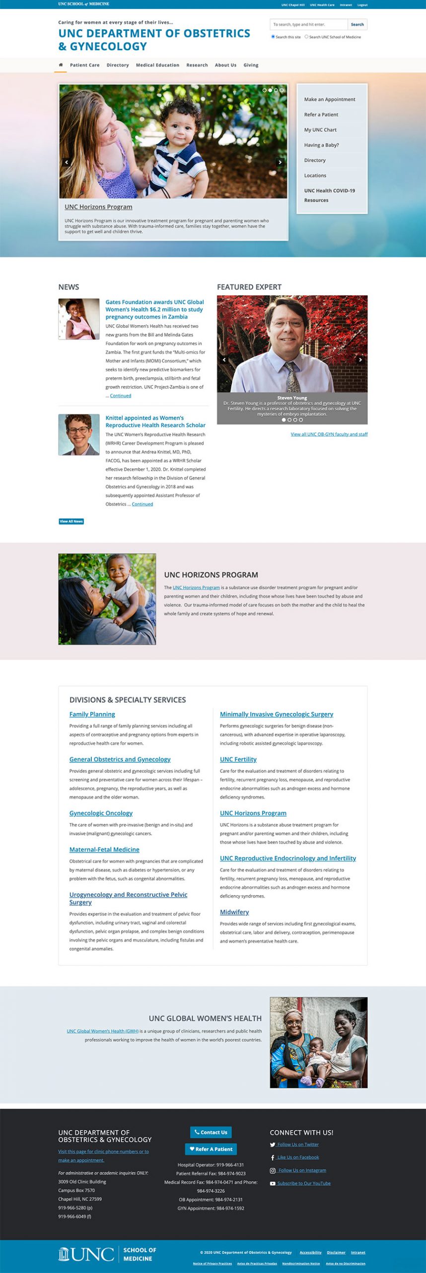
The OB-GYN homepage uses a full-width parallax background image behind the banner and buttons at the top of the page. They also use the full-width background color shortcode to highlight the UNC Horizons program as well as the Global Women’s Health further down the page.


