Panel Boxes
A Panel Box consists of three main components: the Header, Content and Footer. By default, only the Header and Content are displayed. If the Show Footer option is selected during setup, the footer component will display as well.
Columns shortcode was used in the above example to lay the boxes out side by side in two columns.
How to Add a Panel Box
- Place your cursor where you want the Panel Box to appear.
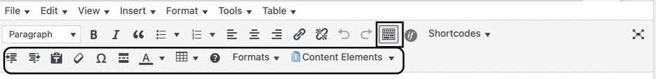
- Select Panels from the Content Elements dropdown menu under Interactive.

- Tip: If you don’t see the Content Elements button in the editor, click the Toolbar Toggle button. This toggles the visibility of a collection of buttons in the editor.
- A dialog box will appear that allows you to configure the panel box settings:
- Choose a Style – this correlates to the color of the box. There are 6 default color options:
- Simple = light gray box
- Primary = medium blue box
- Success = green box
- Information = light blue box
- Warning = Yellow box
- Danger = Red box
- Show Footer – enabling this option adds a footer section to the panel box.
- Custom Class (optional) – for Primary Boxes only, a custom class can be applied to modify the color:
- Dark Blue → add panel-dark-blue.
- Note: this custom class only works with the Primary Box.

- Choose a Style – this correlates to the color of the box. There are 6 default color options:
- Click the Insert Notification button and the shortcode will be added to the page.

Panel Box Modifications
Any of the components (Header, Content or Footer) of a Panel Box can be deleted. Just be sure to delete that entire section. For example, if you wished to remove the Header, you would delete the following from the shortcode:
[panel-header]Heading Goes Here[/panel-header]

Lorem ipsum dolor sit amet, consectetur adipiscing elit, sed do eiusmod tempor incididunt ut labore et dolore magna aliqua. Ut enim ad minim veniam, quis nostrud exercitation.
| # | First Name | Last Name |
| 1 | Bob | Brown |
| 2 | Mike | Brook |
| 3 | Richard | Smith |