Buttons
Large Buttons
Simple Primary Success Information Warning Danger LinkSmall Buttons
Simple Primary Success Information Warning Danger LinkExtra Small Buttons
Simple Primary Success Information Warning Danger LinkButtons With Icons
There are a number of icons that can be added to a button.
Donate Our Location AppointmentsFull Width Buttons
Create block level buttons—those that span the full width of it’s containing element—by selecting the make block option.
Default Primary Success Information Warning Danger LinkHow to Add a Button
- Place your cursor in the location where you wish to add the button.
- Select Button from the Content Elements dropdown menu, under Basic Elements.
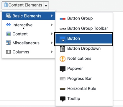
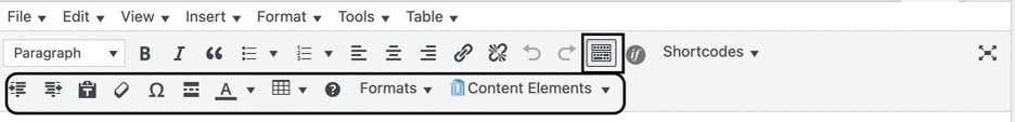
- Tip: If you don’t see the Content Elements button in the editor, click the Toolbar Toggle button. This toggles the visibility of a collection of buttons in the editor.
- A dialog box will appear that allows you to style your button.
- Style – this correlates to the color of the button. There are 7 color options:
- Simple = White button
- Primary = Blue button
- Success = Green button
- Information = Pea Green button
- Warning = Orange button
- Danger = Red button
- Link = Gray button
- Size – select the size of the button.
- Type – leave this set to Link, allowing you to add a URL for the button to link to.
- Select Icon – an optional icon can be added to the button.
- Icon Alignment – align the icon to the left or right of the button text.
- Icon Color – select an icon color that ensures sufficient contrast for accessibility. Here are some suggested colors that provide adequate contrast:
- Default buttons – white (#ffffff)
- Dark buttons – white (#ffffff)
- Light buttons –
- Make Block
- Expands the button to fill the full width of its container (such as a column or content area).
- Ensures the button sits on its own line, meaning no other elements will appear next to it—even if they seem aligned in the editor.
- Useful for creating uniform button sizes.
- Title – enter the text you want displayed on the button.
- Link – replace the pound sign (#) with the url the button should link to.
- Custom Class – dark and light versions of our buttons can be applied with custom classes. See examples below.
- Add btn-light to the Custom Class field to get the light version of any button.
- Add btn-dark to the Custom Class field to get the dark version of any button.

- Style – this correlates to the color of the button. There are 7 color options:
- Click the Insert Button button and the button shortcode will be added to the page.
Alternate Color Options
Light and dark versions of our buttons are available. To use these options, insert btn-light or btn-dark in the Custom Class field when generating the shortcode for a button.
Light Buttons
These buttons should be displayed on a dark background to ensure adequate contrast between the buttons and the background color.
Dark Buttons
These buttons should be displayed on a light background to ensure adequate contrast between the buttons and the background color.
Adequate Contrast
This demonstrates which buttons have adequate contrast when placed on these sample background colors.
White Background (#ffffff)
Medium Buttons
Primary Success Information Warning Danger Link
Dark Buttons
Primary Success Information Warning Danger Link
SOM Light Blue Background (#e2eff8)
Medium Buttons
Primary Success Information Warning Danger Link
Dark Buttons
Primary Success Information Warning Danger LinkSOM Medium Blue Background (#257cb7)
Light Buttons
Simple Primary Success Information Warning Danger Link
Medium Buttons
Simple
Dark Buttons
SimpleSOM Dark Blue Background (#08446d)
Light Buttons
Simple Primary Success Information Warning Danger Link
Medium Buttons
Simple
Dark Buttons
Simple