The Code
The Modular Cards feature is being phased out in favor of the Cells Plugin, which includes the Card layout (available under Syndication) along with additional design options. It also offers a more user-friendly experience. If your site currently uses Modular Cards, consider transitioning to the Cells Plugin for enhanced functionality and long-term support.
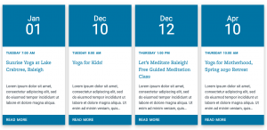
You can display news posts in a Modular Card layout by using the Modular Card shortcode. There are multiple attributes that can be added to this shortcode to change the way the cards look. Simply copy the shortcode from this page and paste it into a page on your site to create the modular cards.
The Basics
The modular cards shortcode at it’s most basic is:
[wc_cards]
This will create a horizontal display of your 4 most recent posts. This default 4-card layout works well on home pages or other pages without left-hand navigation. Because there is not enough room for all 4 cards to display on one line on pages with left-hand navigation, the forth card will wrap to it’s own line. To prevent this you can specify how many cards to display. This option is explained below.
Customize Cards
You can change the way your cards look using short code attributes. You will add these attributes inside the brackets of the existing base shortcode. The code will look like this:
[wc_cards category="categoryname" date_format="relative" title_lines="3"]
Number of Cards Displayed
By default the shortcode displays 4 cards. To change the number displayed add, count=”number” to the base shortcode.
[wc_cards count="6"]
To display all posts add, count=”all” to the base shortcode.
[wc_cards count="all"]
Hide Images
The modular cards will automatically display the featured image as the image for the card. If your cards don’t display an image, add a featured image to each post.
If you don’t want any images to display in the cards, add image=”none” to the existing base shortcode.
[wc_cards image="none"]
Image Size
The default aspect ratio of the card images is 3×2. This can be changed to 2×1, 1×1, 2×3 or 3×2 by adding crop=”aspect ratio” to the existing base shortcode.
[wc_cards crop="1x1"]
Image Hover State
When a mouse hovers over a modular card, the feature image will “zoom in.” To change this so there is no zoom effect, add hover=”none” to the existing base shortcode.
[wc_cards hover="none"]
Date Format
The modular cards by default will display how long ago a post was published (i.e. “4 months ago”). This can be changed to display the actual publish date by adding date_format=”settings” to the existing base shortcode. This will display an actual date such as “October 24th, 2019.”
[wc_cards date_format="settings"]
To remove the date altogether, add date_format=”none” to the existing base shortcode.
[wc_cards date_format="none"]
Title Lines
The base modular cards shortcode will display 3 lines for the title of each post. However, some post titles are shorter while others are longer. Shorter titles will display extra white space while longer titles will get cut off. The following attribute allows you to specify how many lines of the title will display in the cards. Simply add title_lines=”number” to the existing base shortcode.
[wc_cards title_lines="2"]
Alternatively, you can set title_lines=”all” to display the entire title of each post. This will result in modular cards of varying height.
[wc_cards title_lines="all"]
Excerpt Lines
The post excerpt will display below the title. If the excerpt field is left empty, info from the body content will be displayed in its place. By default, the modular cards will display 5 excerpt lines. However, this setting can be changed by adding excerpt_lines=”number” to the existing base shortcode.
[wc_cards excerpt_lines="4"]
Alternatively, excerpt_lines=”all” can be added to display the entire excerpt of every post. This will result in cards of uneven height. If the excerpt field is left blank, 12 lines from the body content of the post will display.
[wc_cards excerpt_lines="all"]
Color Setting
This attribute allows you to specify the color of the “READ MORE” bar at the bottom of each card. This color is set using hexadecimal color codes. Since the READ MORE text is white, the color behind it needs to be dark to ensure there is enough color contrast and the text remains legible. A couple of good alternative colors is Carolina Athletics Navy which has the hex color code of #13294B, black which has the hex color code of #000000, or dark gray with a hex color code of #4f4f4f. To specify the color, add color=”hex color code” to the base shortcode.
[wc_cards color="#13294B"]
Category Lines
Categories and tags can be used to filter which news posts are displayed. By default, the modular cards do not display the category a post belongs to. However, this functionality can be turned on by adding category_lines=”all” to the existing base shortcode.
[wc_cards category_lines="all"]
If you don’t wish to display all categories, you can specify how many by using category_lines=”number”.
[wc_cards category_lines="3"]
Tag Lines
Categories and tags can be used to filter which news posts are displayed. By default, the modular cards do not display the tag a post belongs to. However, this functionality can be turned on by adding tag_lines=”all” to the existing base shortcode.
[wc_cards tag_lines="all"]
Alternatively, you can specify the number of tags displayed by using tag_lines=”number”.
[wc_cards tag_lines="2"]
Display Events in Modular Cards
If you wish to display events using the modular cards, add type=”event” to the base shortcode. This will display 4 upcoming events by default.
[wc_cards type="event"]
If Featured Images are assigned to events and you wish to display them in the cards, add image=”featured” to the shortcode.
[wc_cards type="event" image="featured"]
All the code attributes that are explained above, besides the Date Attribute, work when displaying modular cards with events.


